Instead of making a personal website with the use of Frontpage 2003, I decided to share my knowledge in photo editing with the use of Adobe Photoshop CS3.
As part of the final project of my students in Computer Class 4, I introduced to them
Electronic Poster Making with the use of Adobe Photoshop CS3.
I gave them the same images to work with in order to come up with a relevant and eye-catching electronic poster for our school - Manay National High School. The students find electronic poster making fun and challenging task. Their authenticity and creativity have been challenged.
Here are the Electonic Posters designed by 4th year students. Please help me judge which one is the best poster so that i can also decide to whom shall i give the highest possible grade.
 |
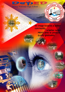
| Electronic Poster 1 |
|
 |
| Electronic Poster 2 |
 |
| Electronic Poster 3 |
 |
| Electonic Poster 4 |
 |
| Electronic Poster 5 |
|
|
Based on the principles of design, which posters will you put in the Top 3? (consider other posters in the next page)
View more electronic posters here:
Electronic Poster Making - Adobe Photoshop CS3 (2/3)
Electronic Posters Designed with Adobe Photoshop CS3 (3/3)
To receive updates right into your inbox, please don't forget to subscribe:


.png)


)
5 Comments
Number 1 - Some images are not proportionately resized. (klaro na nainat). I won't buy it.
ReplyDeleteNumber 2 - Good
Number 3 - Good.
Number 4 - Good. but I am destructed by the flag background. See the stars and the sun? Nainat ang image.
Number 5 - Is my choice. Neat and more pro.
This is just my opinion.
Good job you guys. You are lucky you know all these stuffs early. Congrats to the teacher.
thank you mam for the feedback.
ReplyDeleteI'm not a Pro Graphic Artist but I could say that my eyes have been set to Poster #3 then Poster #5 (and that goes in hierarchy). Why? Because the creators of the two posters have shown their innate creativity as they have managed to combine the elements in a unique matter which is pleasing to eyes.
ReplyDeleteLagi po nating tatandaan na ang Graphics, mapa-poster man or any kind of digital art...kelangan neat ang pagkagawa at dapat hindi masakit sa mata. Kung gagamit man tayo ng flashy colors (ex.red), dapat po nasa tamang blending.
Graphics are meant to capture the attention of the viewers. So we must be keen enough to the details of 'art'. :)
@Kent: Thanks for the comment. I really appreciate this one and I will relay this to my students who are just newbies in terms of design.
ReplyDeleteThis is a good poster. It has all the elements needed to make it alive and tell a story behind the design.
ReplyDeleteLarge Format Printing
If you have comments, questions, or additional info to add in this post please share them here.